Mapping Supply and Demand for College Graduates Across the US
We mapped supply and demand for college graduates across 391 US metro areas. The pipeline fills just 62% of annual openings nationwide.

Supply and demand for college graduates isn't one national number — it's 391 different stories.
As I've been posting for the past 2 months I've had a number of people reach out to share notes, or ask questions. A few of these threads have led me to looking more closely at how collegiate outcomes relate to the broader economy, and local employment demand.
This in turn has led me to spend some time with both the regional employment statistics, and the national Department of Labor, Bureau of Labor Statistics data. So I'd thought this week I'd share some of the things I've found. Some of the nascent analysis I've done out of that (with the caveat that a lot of this is new to me), and maybe use this as an opportunity to learn as opposed to just yap.
In some respects I was a bit surprised it never occurred to me to do this sort of thing. Obviously we can look at collegiate outcomes in aggregate — but to the extent a major is filling a real labor market hole, or an institution itself is aligned with those needs, then that's actually...good to know?
I joined three public datasets metro-level employment from BLS, state occupational projections, and College Scorecard graduate counts to measure how much of each metro's annual hiring demand the 4-year college pipeline actually covers. If you're a sicko and want the full methodology, it's at the bottom.
For now: the output is one number per metro per career — annual flow against annual flow, not total jobs versus one year of graduates.
The intent is to show where supply and demand are out of whack — and who relies on outside labor to fill gaps versus who doesn't.
Here are some of the narratives that jumped out to me that I'll maybe be looking more into.
The National Picture
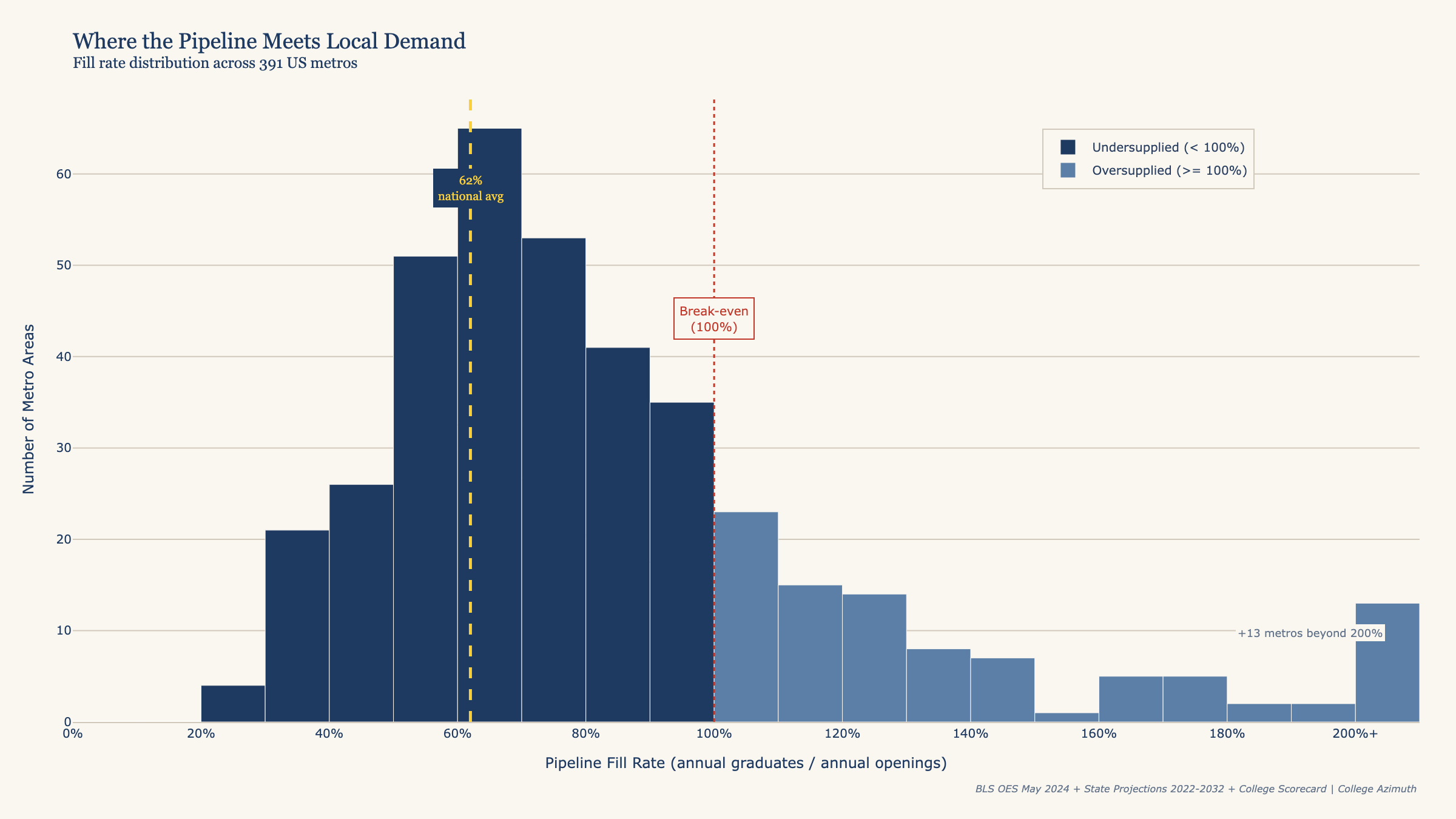
In aggregate we see that 62% of job openings in theory could be covered by graduating college graduates. Most states in a deficient here, a handful are not.
We start at the national level to establish a baseline because interstate migration doesn't close this gap. A software engineer moving from California to Illinois is a 1-for-1 trade — it changes where the gap is, not the size of it. The only things that actually reduce the structural gap nationally are: graduates from 4-year programs (what we're measuring), people returning to the workforce — parents re-entering, mid-career changers — people stepping up from associate's-level work into roles that typically require a bachelor's, and people who are underemployed finding their way into something that better uses their credentials.
Undoubtedly this gap isn't covered entirely by graduates as career changers fill tech roles. Workforce reentrants fill nursing shifts. Whether it's enough to cover 38% of annual openings? Honestly, I'm not a workforce economist and I can't say with confidence what that number should be. 62% feels light to me — but I'm holding that loosely. If nothing else it provides some sense of how competitive a particular opening, in a particular field might be. If there's more people entering the work force than jobs that can absorb them then thats an issue.
| Annual bachelor's-level openings (US metros) | 3.3 million |
| Annual bachelor's graduates (4-year programs) | 2.1 million |
| Pipeline fill rate | 62% |
| Metros where pipeline falls short | 296 of 391 |
The Map of Supply and Demand for College Graduates.
The West Coast is almost entirely dark red critically undersupplied which is slightly surprising considering the size and scope of the California educational system. Texas and the Sun Belt are red to orange. The Midwest is a scatter of orange and amber, close to the national median. The green concentrates in the Northeast and, perhaps surprisingly, in pockets of Alabama.
The green metros fall into two categories. Massachusetts and Pennsylvania are university-corridor states — they produce far more graduates than their local economies absorb, and the surplus migrates (more on this later).
Alabama's green dots are a different story — pure college towns. Tuscaloosa, Auburn, Florence. In each case the university dominates a small metro. The graduates leave, but the model credits them to the local metro because that's where the school is. This model allocates graduates within states, not across them. Pennsylvania's oversupply and Seattle's undersupply exist simultaneously in the data because a Pennsylvania graduate is credited to Philadelphia or Pittsburgh — not to DC or New York. We're identifying the producers and the consumers; the labor market does the connecting.
| Metro | Fill Rate |
|---|---|
| San Jose, CA | 30% |
| Washington DC | 32% |
| Denver, CO | 33% |
| Seattle, WA | 34% |
| Austin, TX | 36% |
| Dallas, TX | 41% |
| Philadelphia, PA | 119% |
| Boston, MA | 234% |
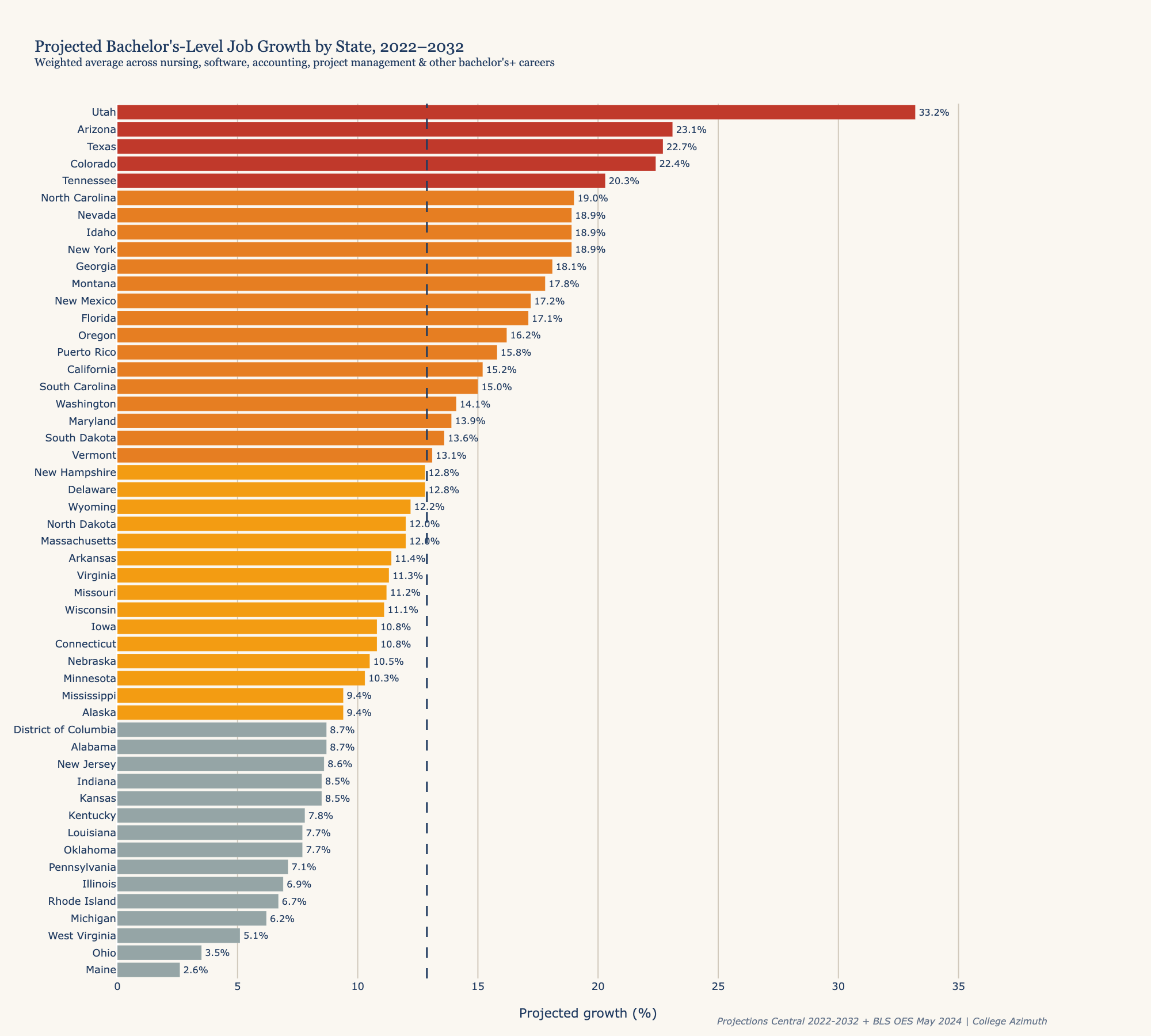
Projected Growth Rates for Various Careers at the State Level.
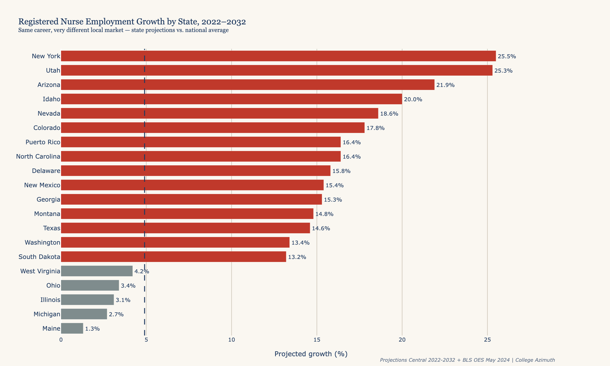
The standard reference for career growth projections — the one most people encounter through the BLS Occupational Outlook Handbook, through counselors, or through career planning tools — uses national averages. The figure for registered nurses: 4.9% growth from 2022 to 2032. State labor agencies publish their own projections, and we used those here. But the numbers that filter into most career guidance don't.
That 4.9% is accurate for the national aggregate. It's not accurate for almost any specific state.
New York's nursing market is growing at five times the national rate. Pennsylvania is essentially flat. The same career's prospect is very different depending on the state you are looking at.
This matters because most people don't move that far to find work. About two-thirds of graduates stay in-state and half work in the metro nearest their college (Deming and Noray, 2022). The state-level number is the one that actually shapes your options but most of the narratives around which jobs are growing and which ones are not are usually presented nationally, not state by state.
The below chart shows what those internally collected job projections look like in aggregate state by state. As we can see some states are growing much faster than others. This obvious will impact how internal career projections look within them.
Interesting Supply and Demand Stories that I found interesting
What Happens When Your Higher Education Is Too Good?
Based on the national aggregated data, it's clear that it's typical for there to be more demand for bachelor's-level jobs than there are graduates. This makes some sense — there are more people looking for jobs at any given moment than people just graduating from college, and organizations aren't just hiring new graduates. Experience hires, career changers, and internal promotions all fill the gap.
There are only a handful of states where that isn't the case. Massachusetts seems obvious — storied institutions, relatively small population, grads flowing to New York and San Francisco. Rhode Island is in the same category.
Alabama is on the list, which is more surprising. I guess the Nick Saban effect is real or more likely Alabama's Tuscaloosa and Auburn are both small metros anchored by large universities that produce graduates well in excess of what the local economy needs.
But Pennsylvania genuinely caught me off guard.
| Metro | Fill Rate |
|---|---|
| Scranton | 168% |
| Lancaster | 160% |
| Allentown | 156% |
| Pittsburgh | 127% |
| Philadelphia | 119% |
Pennsylvania, across the board, has more college graduates than it has job openings. Not just in the college towns in Pittsburgh and Philadelphia too. That's the unexpected part. In most states, the big cities absorb the excess supply from the college towns. In Pennsylvania, even the large metros are running a surplus.
The question is why. It seems like a combination of two things.
The first is the sheer density of private institutions. Penn, Carnegie Mellon, Swarthmore, Haverford, Villanova, Lehigh, Bucknell, Dickinson — Pennsylvania has more nationally-recruiting, highly selective private universities in a single state than almost anywhere else in the country. These schools attract students from outside Pennsylvania and produce graduates who disproportionately leave. Research from the W.E. Upjohn Institute finds that highly selective institutions retain the fewest graduates in-state — University of Michigan holds onto only 40% of its graduates, while Eastern Michigan University holds onto 76%.^2 Pennsylvania has a dense cluster of schools at the low end of that retention spectrum.
The second is industrial decline. Pennsylvania was historically a major manufacturing state. It isn't anymore. A lot of the old towns that built their identity around those industries are a shell of their former selves. The higher education industry, meanwhile, has kept chugging along completely unbothered, producing graduates for an economy that has partially moved on without them.
Compare this to Ohio (75% fill rate) or Michigan (79%) — states with nearly identical industrial histories and comparable levels of Rust Belt decline. Both are undersupplied. The difference is that Ohio and Michigan don't have the same cluster of nationally-ranked privates pulling students in from across the country and exporting graduates elsewhere.
So what actually happens to Pennsylvania's surplus graduates? They leave.
The University of Pittsburgh tracks this: of the Class of 2022, 67% stayed in Pennsylvania, and the top out-of-state destinations were New York City (128 graduates), Washington DC (61), Boston (46), and Chicago (33).^1 The graduates are flowing exactly where the map says the jobs are.
I spent some time working in Pittsburgh when I was at Uber. It's a beautiful city — genuinely underrated, a lot of fun. It's a little baffling that a place with this much educational infrastructure and this much talent hasn't found a way to retain more of it. That's not a criticism of the city. It's the whole point of this analysis.
The State Growing Faster Than Its Own Pipeline
Texas doesn't have a higher education problem. It has UT Austin, Texas A&M, Rice, UT Dallas, TCU, Baylor, the University of Houston — real universities with real capacity. It's just that the state is outrunning all of them at once.
| Metro | Fill Rate |
|---|---|
| Austin | 36% |
| Dallas | 41% |
| San Antonio | 46% |
| Houston | 47% |
All four major Texas metros are below 50%. The first instinct is to call this a tech story. Texas is the second fastest-growing state for bachelor's-level careers in the country — software developers alone are projected to grow at 46.7%, nearly three times the national rate. Austin and Dallas both have substantial tech footprints. That must be what's driving the gap.
Except it isn't. Or at least, it isn't only that. Texas added 560,000 new residents in 2024 — the largest absolute population gain of any state in the country, for the fourteenth consecutive year.^3 Those people are moving for jobs. And when that many people arrive that quickly, something else has to come with them.
Here's what's actually at the top of the Dallas gap list:
| Career | Dallas annual gap |
|---|---|
| HR Specialists | 3,061/yr |
| Software Developers | 3,329/yr |
| Accountants | 2,383/yr |
| Elementary School Teachers | 2,939/yr |
| Registered Nurses | 2,282/yr |
When a tech company moves its headquarters to Texas, it brings its engineers. It doesn't bring its HR department, its accountants, its employees' kids' teachers, or its workers' nurses. The gap in Texas is concentrated in exactly the infrastructure careers that support a growing economy — the people who run the organizations hiring everyone else, who file the taxes, who staff the hospitals, who teach the children of the workforce arriving from California and New York.
The teacher gap makes it concrete. Houston, Dallas, San Antonio, and Austin each fill 13% of their elementary teacher openings from the college pipeline. One graduate for every seven positions that open annually, in cities whose school enrollment grows every year.
Pennsylvania's problem is that the economy contracted under the schools. Texas's problem is that the economy is running away from them.
A Couple of Other Things I Noticed About In-Demand Fields
Accounting has a problem. I get it as accounting was my least favorite class in business school. But if you're looking for job security in a field that's genuinely undersupplied, well. Los Angeles fills 8% of its annual accounting openings from the college pipeline. Denver fills 8.5%. New York — with dozens of business schools — covers 37% of local demand. Accounting has the second-largest total annual pipeline gap of any career we measured.
Then there's Ann Arbor, Michigan. If there was any place you'd expect to have a handle on nursing, you might think it was Ann Arbor. University of Michigan. Michigan Medicine, one of the largest academic medical centers in the country, 30,000 employees, a 1,000-bed hospital. One of the best nursing programs in the United States, physically located in the same building where you'd work. And yet Ann Arbor still has a nursing shortage of 322 positions per year.
Nursing I find more interesting than almost any other career in this dataset, because it's so obviously and visibly in demand. So much so that it's more or less the only field where for-profit institutions have shown consistently positive graduate outcomes. The career demand is strong enough to overcome the structural disadvantages those institutions carry. And yet even with that, even with institutions specifically built to produce nurses quickly, the gap persists everywhere. The clinical demand is structural. There is no version of the educational pipeline that closes it.
What's Your State Look Like?
If you want to see the top 10 in-demand careers for your specific state, I put together an interactive version of this data below. Select your state and see what the pipeline gap looks like where you are.
A Note on Methodology
The gaps in this analysis are measured as annual job openings minus annual bachelor's graduates allocated to each metro. "Openings" come from state-level occupational projections (Projections Central 2022-2032, supplemented with direct data from the New York Department of Labor where the federal aggregator provided only 19% of actual openings). "Graduates" come from the College Scorecard, pooled at the state level and distributed to each metro proportionally by employment share — the logic being that a UT Austin grad is as likely to work in Dallas or Houston as in Austin, depending on where the jobs are.
What this analysis does not capture: - Interstate migration (a Pennsylvania grad working in New York isn't in our model) - Community college and bootcamp pipelines - Career changers and experience hires - Internal promotions into bachelor's-level roles
The 38% of annual openings not covered by the bachelor's pipeline comes from all of these sources. The gap is a measure of pipeline capacity relative to demand — not a count of unfilled job postings.
State growth projections are from 2022-2032 and predate significant changes in the software and professional services markets. We'll update the analysis as projections are revised.
What we're not claiming: This is not a count of unfilled job postings. A 36% fill rate in Austin doesn't mean 64% of jobs sit empty — it means the 4-year pipeline alone doesn't cover annual demand. The difference comes from career changers, experience hires, interstate migrants, and workers with sub-bachelor's credentials stepping into bachelor's-typical roles.
^1 University of Pittsburgh Career Center. "Post-Graduation Status Report: Survey Class of 2022." University of Pittsburgh Student Affairs, 2023.
^2 Hershbein, Brad. "Brain Drain or Brain Gain? Where University Alumni Locate." W.E. Upjohn Institute for Employment Research, 2023. Drawing on: Conzelmann, Johnathan G. et al., "Grads on the Go: Measuring College-Specific Labor Markets for Graduates." Journal of Human Resources, 2023.
^3 U.S. Census Bureau. "Vintage 2024 National and State Population Estimates." Released December 19, 2024.
Data: BLS OES May 2024 | Projections Central + NY DOL 2022-2032 | College Scorecard April 2025 | Analysis: College Azimuth
