A Value-Added Approach to College Outcomes
We updated our value-added earnings metric — the WAR for colleges. The model now separates what students bring in, what a school offers through its program mix and market position, and what remains unexplained. Here is how we built it, and what it shows for five Illinois schools.

At the beginning of this writing journey I outlined a few of the concepts I was working on, and one of them was this idea of a WAR — Wins Above Replacement — for college earnings. If we know, and accept, that students come in with a baseline — some combination of aptitude, career interests, family support, socioeconomic starting point — then how do we pull apart what the school adds from what the student brought with them?
That was the original version based on a simple concept: predict what a school's graduates should earn given who enrolls, compare it to what they actually earn, and the gap is the value-added.
As the Department of Education updated their data — shifting from 10-year post-enrollment earnings to 4-year post-completion earnings — it was a good a time as any to re-group on this concept. Not just to re-run the numbers, but to expand and refine how I thought about this based on work we've been doing over the past few months. The labor market mapping showed that geographic baselines matter more than national averages. The GPS framework showed that program mix within a school can swing your outcome by tens of thousands of dollars. Some of the feedback we've gotten pushed me to think harder about what the model was and wasn't capturing.
In this post I'm going to talk about the evolution of the value-added metric — what we're now measuring, why, and then break down some of the movement we saw from the old model to the new one.
The original model
The original model was built from pretty basic inputs:
- Median family income from FAFSA as the main socioeconomic control
- A flat $30,000 earnings floor — no school's predicted earnings could go below $30K, regardless of where it was located
- Admit rate as a single continuous variable
- Earnings measured 10 years after enrollment, counting everyone who started — graduates and non-completers alike
One number per school. It controlled for student profile in a way that raw median earnings or U.S. News rankings don't, and that was the value.
What we've added since then
The Scorecard data shift happened to coincide with a bunch of work we'd already been doing — labor market analysis that showed geographic context matters, program-level earnings work that showed composition effects are real and large, graduation rate analysis that raised the question of survivorship. We'd been building these pieces across other stories. The data update gave us the chance to pull them into the value-added framework itself.
We spent a lot of time thinking about each of the inputs to the model — running regressions, testing different variable configurations, seeing where our narrative lined up with the data and where it didn't. Some of what I'm about to describe came out of running the models and watching what happened. A few things we expected to matter didn't. A few things we hadn't considered turned out to be important.
At a macro level, this work led us to evolve the framework in one big way: we now have three tiers of analysis that we didn't have before.
Tier 1 — Predicted student factors. Given who this school enrolls — their socioeconomic profile, the school's selectivity, what completion rate we'd expect for students like these, where the school sits geographically — what earnings should we predict before the school does anything distinctive?
Tier 2 — Institutional observations. Things we can see about what the school offers: its curricular choices (STEM share, health share, business share), how well those programs align with local labor market demand, enrollment scale.
Tier 3 — The residual. What's left after Tier 1 and Tier 2. The gap between what we'd expect from the students and what we can explain through observable institutional factors — and what the school's graduates actually earn. This is the part we can't directly measure. It's where faculty quality, advising, culture, network effects, and everything else we don't have data on lives.
Socioeconomic controls (Tier 1)
Before: One number — median family income from FAFSA.
Now: A composite built from four inputs:
- Median family income — what aided students' families report earning
- Average dependency income — a broader income measure that captures the full dependent student population, not just those who filed for aid
- Pell Grant share — the percentage of students receiving federal need-based grants, which is a direct measure of how many low-income students the school serves
- First-generation share — the percentage of students whose parents didn't complete college, which captures something income alone doesn't — family familiarity with higher education and the support structures that come with it
We grappled with the right approach to SES benchmarking here. The family income proxy was limited — it only captures students who file FAFSA, which at some schools is a small and unrepresentative slice of the student body. We tested a number of different configurations and found that a composite factor ended up having more predictive power than the single-variable approach in our previous model. The composite gives us a more complete picture of who actually enrolls at a given institution, which is what the expectation baseline needs to be built from.
Geographic baseline (Tier 1)
Before: A flat $30,000 floor applied to every school in the country. Mississippi and Manhattan, same number.
Now: A state-level earnings threshold — essentially a geographic floor for what "above expectation" means, carried through the federal data migration.
The logic here is straightforward: the same job, for the same person, ends up earning more in one place than another because cost of living is higher. If you don't account for that, you give an unearned boost to schools that happen to sit in high-wage labor markets. A school in the Boston metro whose graduates earn $70K may not be adding as much value as a school in Mississippi whose graduates earn $55K — the Boston school is riding the local labor market baseline.
This is something the Carnegie Social Mobility Index does, and we actually shied away from it in our first pass. We decided to add it back with this framing: the baseline expectation should reflect where the school operates, not a national average that doesn't mean anything specific. Illinois schools now sit against a $32,990 threshold. Boston College against $37,113. UNC against $30,928.
Graduation rate and selectivity (Tier 1)
Before: No completion variable in the model. The old 10-year earnings surface included non-completers in the measurement, which meant the model was in effect catching the downside — students who didn't get through a program or make it to the other side were pulling the earnings number down naturally.
Now: The 4-year source measures only completers. Only the survivors show up in the data.
As we've talked about in the GPS series, knowing the downside is a critical part of analyzing any institution. So we had to think hard about how to capture it in this metric. Otherwise we'd see too much bias toward schools that have some good outcomes, but those outcomes aren't available to most of their students.
On one hand, most people think about graduation rate as an output. The school did or didn't do its job. Students made it through or they didn't.
But the entire point of this exercise is built on the idea that students themselves are an input — that they bring characteristics that form independent of the institution. A high-capacity student with family support, financial stability, and strong preparation is probably going to graduate regardless of what the school does. On the other end, someone who can't make tuition or has too much going on at home may not — and that's not necessarily the school's failure.
If that's true for earnings, it's also true for graduation rate. So how do we handle this?
The answer is probably both — it depends on who the school serves and how much risk they take on. Harvard gets the pick of the litter. They can select against completion risk and they don't take much gamble on whether students finish. UIC takes a ton of risk — 49% Pell, open-leaning admissions, a large part-time and adult student population. Simply leaving graduation rate out of the model would ignore that entirely.
So the question becomes: how do we pull apart the student side of graduation from the institutional side, and how do we give credit to schools that take on higher risk and make something of it?
This led us to embed expected graduation as a metric in the model. We predict what a school's completion rate should look like given who enrolls — their SES profile, selectivity, age mix, part-time share — and use that prediction as the input to the earnings expectation. The actual completion rate stays on the output side. Completion outperformance isn't a literal bonus term in the model — but schools that graduate more students than expected tend to produce better completer earnings, and that flows through to the value-added outcome naturally.
| School | Expected completion | Actual grad rate | Gap |
|---|---|---|---|
| University of Chicago | 91.1% | 95.9% | +4.8 |
| UIC | 49.6% | 61.6% | +12.0 |
| DePaul | 59.0% | 67.8% | +8.8 |
| Northwestern | 92.2% | 95.1% | +2.9 |
| UIUC | 71.9% | 85.1% | +13.2 |
UIC's expected completion is 49.6%. Its actual rate is 61.6%. That 12-point gap is real institutional performance — but it stays on the output side. The input to the earnings expectation is the 49.6%. That's why UIC's value-added remains high in the more granular model — the baseline isn't getting credit for the school's own completion outperformance.
We then had to make sure we were comparing apples to apples. The first version of the graduation prediction model had elite institutions at around a 77% expected completion rate — obviously wrong for schools like UChicago or Northwestern that graduate 95%+ of their students. The model couldn't tell "very selective" from "ultra-selective."
So we took it a step further and ran the regression against a selectivity classification — elite, selective, moderate, open-leaning, open. That let the model set different expectation surfaces for different types of schools. UChicago's expected graduation rate went from 77% to 91.1%. Northwestern's to 92.2%. The selectivity tier also flows into the earnings prediction itself, so an elite school is expected to produce higher earnings than an open-access school — as it should be.
Program mix and labor market alignment (Tier 2)
The original value-added was one number: actual minus expected. If a school beat expectations, you knew by how much — but not why.
We set up Tier 2 to figure out what factors we knew we could measure on the institutional choice and control side, and how much those might tell us about what to expect from a given school.
The first one is program mix. There's a lot of discourse out there about whether college institutions are doing a good job ensuring their programs are aligned with the broader demands of the labor market — both in general and specifically around where they're located. Schools make curricular choices. They invest in certain departments, sunset others, expand programs or let them run at the same size they were twenty years ago. Those choices have consequences for what their graduates earn.
For instance, Northwestern still has a strong journalism school despite demand and pay for that career decreasing over the past decade. There are plenty of reasons why Northwestern would persist with that — some good, maybe some not — and we're not here to editorialize on it (sorry for the pun). But it's still something that has an impact on the wages a typical Northwestern graduate might expect. A school that's 40% STEM is going to produce a different earnings profile than one that's 30% business and 15% education — not because one is a better school, but because of what they chose to offer.
Beyond program mix, we also looked at:
- Enrollment scale — larger institutions tend to produce stronger outcomes through employer familiarity and network effects
- Labor market alignment — how well the school's programs match undersupplied occupations in the regional labor market, drawing on the BLS data from our supply-demand mapping
What Tier 2 does is separate "this school teaches high-earning programs in a market that needs them" from "this school adds value beyond its portfolio." Those are different claims, and the old model couldn't tell them apart.
The residual (Tier 3)
The residual was always there — it was the whole value-added number in the old model. The gap between expected and actual. But it was carrying everything: program mix, labor market effects, enrollment scale, and whatever the school itself was contributing. All in one number.
What we've done with Tier 2 is try to put some color into the parts of that gap we thought we could explain. And what that does is make the residual — what's left — more meaningful. It's no longer "how far above expectation is this school." It's "how far above expectation is this school after we've accounted for what it offers and where those programs land."
When we combine both tiers — student profile and institutional observations together — the model explains about 70% of the variance in graduate earnings on the fully covered four-year subset (about 1,550 schools where we have complete program and labor-market data). That leaves roughly 30% that we can't attribute to either the students walking in or the observable choices the school makes. That's the residual.
A school can engineer a high STEM share. It can recruit students who were already going to do well. But a positive residual after all of that? That's something we can't easily attribute to observable choices. It could be faculty quality, advising, career services, alumni networks, culture — things we don't have clean data on. The honest statement is that the residual is real, not that we know exactly what's behind it.
How to read it
Here's what the three tiers look like in practice, using the five Illinois schools we've been tracking since the original analysis.
The full picture — from predicted to actual
| School | Predicted earnings (Tier 1) | Actual earnings | Total value-added | Program attribution (Tier 2) | Residual (Tier 3) |
|---|---|---|---|---|---|
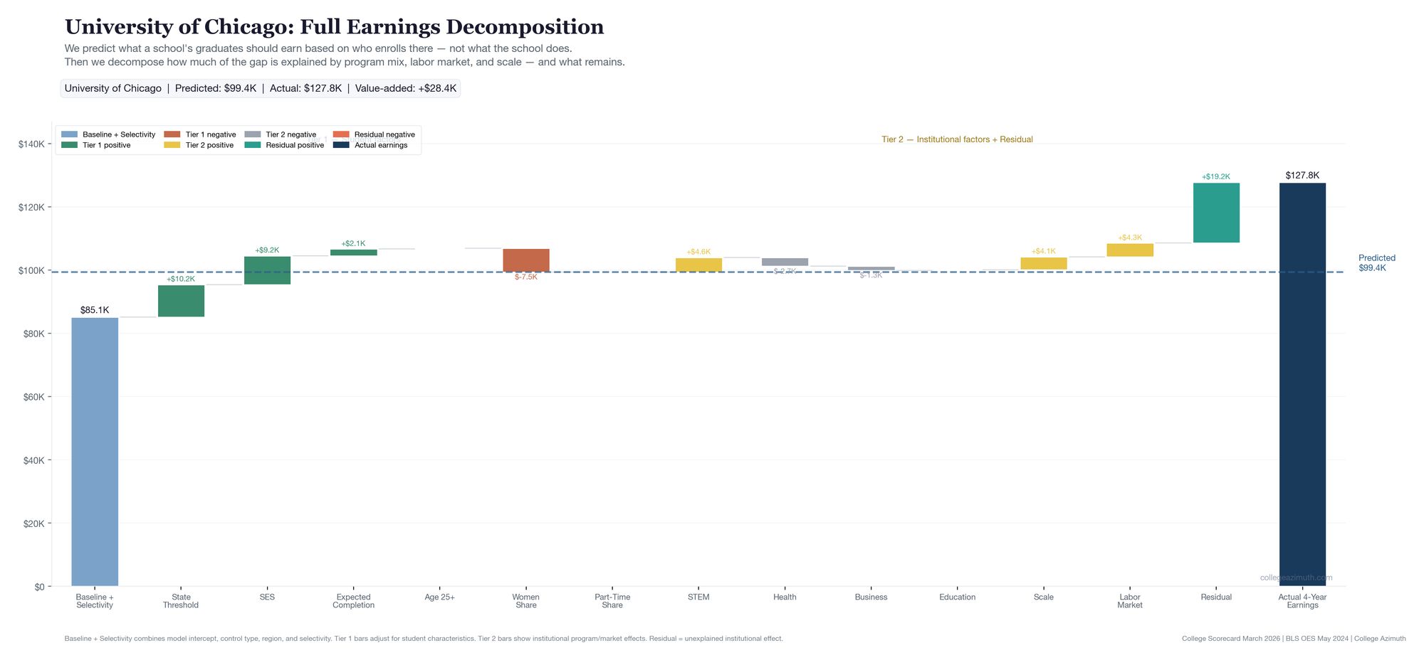
| University of Chicago | $99,368 | $127,757 | +$28,389 | +$9,153 | +$19,236 |
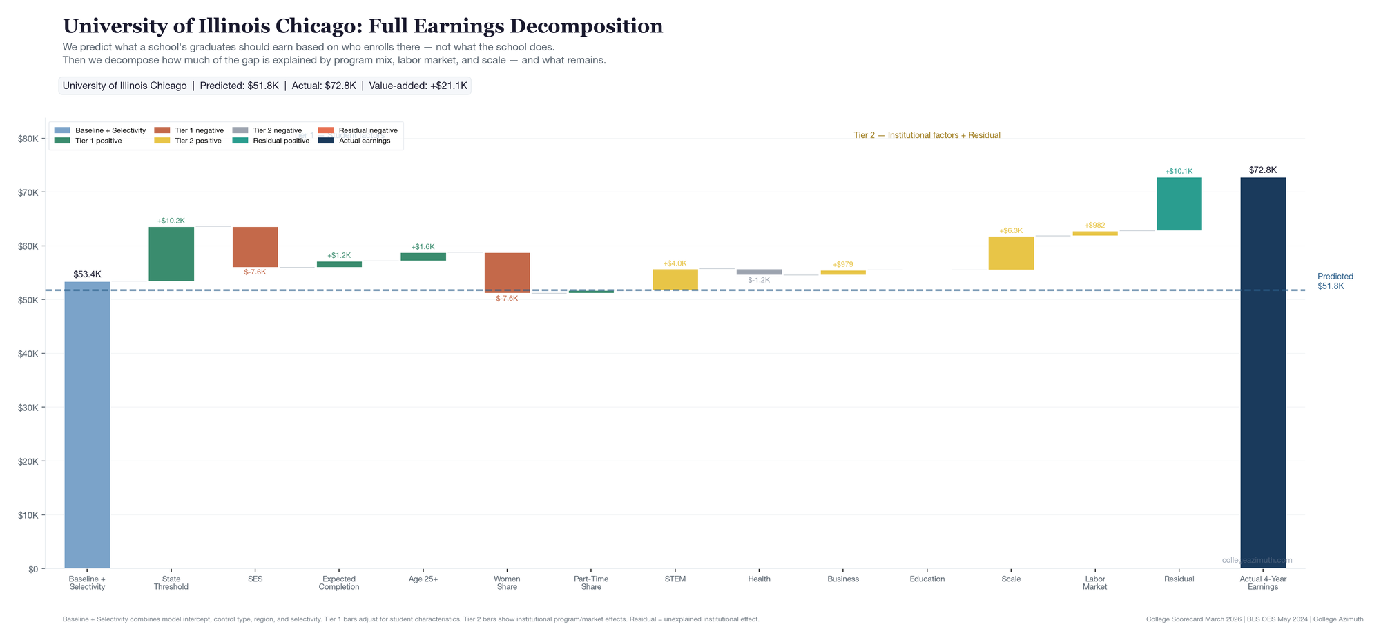
| UIC | $51,753 | $72,839 | +$21,086 | +$11,036 | +$10,050 |
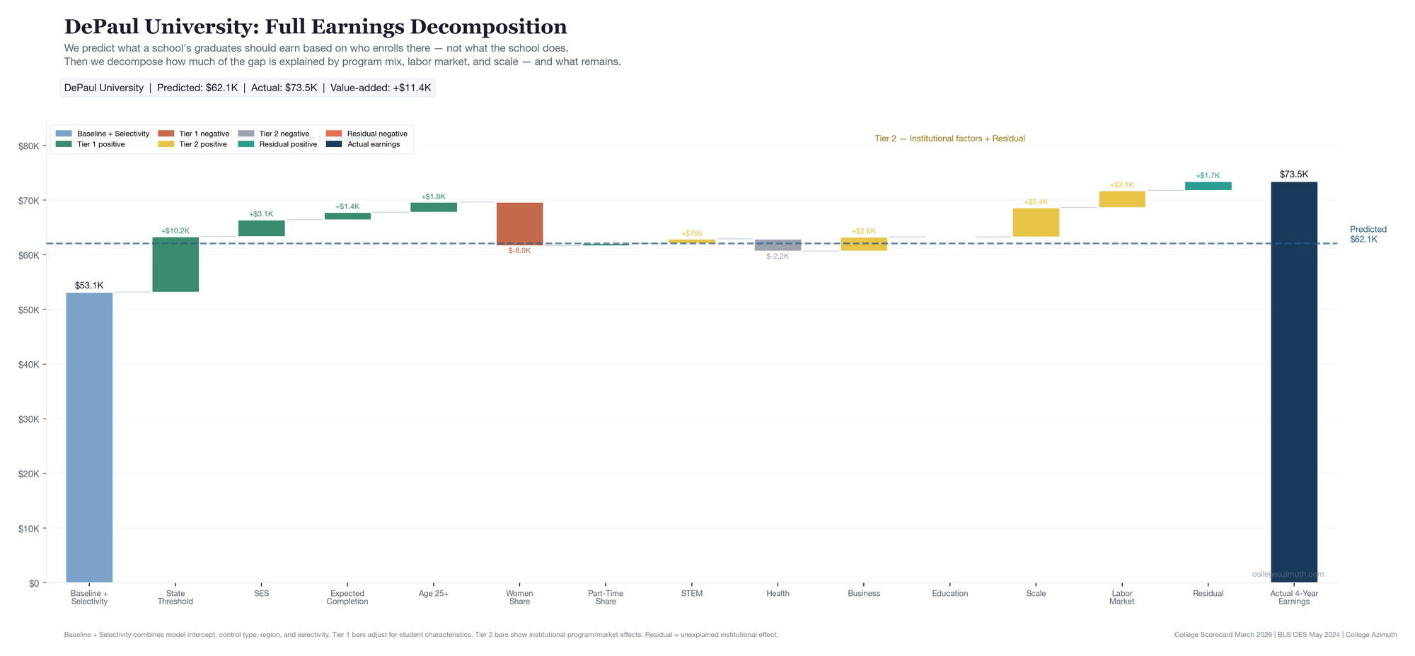
| DePaul | $62,086 | $73,466 | +$11,380 | +$9,679 | +$1,701 |
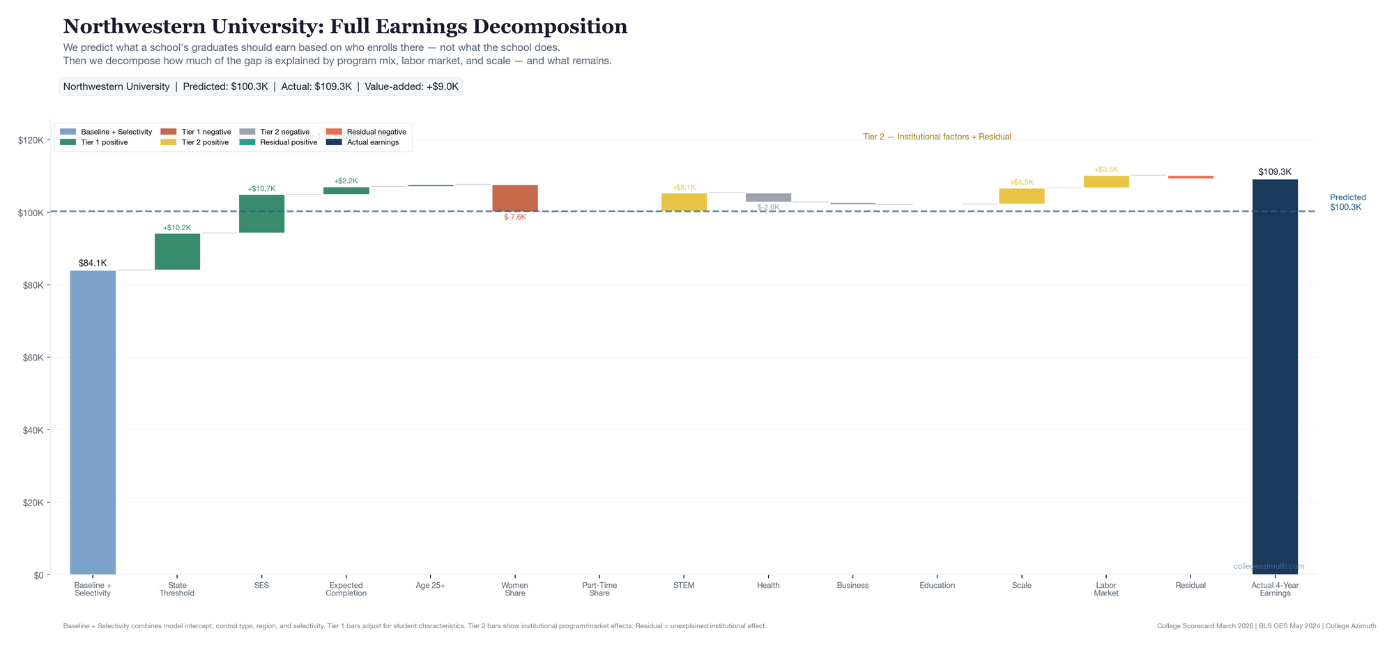
| Northwestern | $100,289 | $109,275 | +$8,986 | +$9,939 | -$953 |
| UIUC | $72,985 | $79,628 | +$6,643 | +$14,505 | -$7,862 |
Start from the left. The predicted earnings column is the Tier 1 output — what the model expects based on who enrolls. UIC's is $51,753. Northwestern's is $100,289. That gap isn't a quality judgment. It's a reflection of the student profiles: Northwestern is elite-tier with an econ composite of 1.220. UIC is open-leaning with an econ composite of -0.871. The model expects different things from different starting points.
Then look at what actually happened. UIC's graduates earn $72,839 — about $21,000 more than predicted. Northwestern's earn $109,275 — about $9,000 more. Both beat expectations, but by very different amounts relative to where they started.
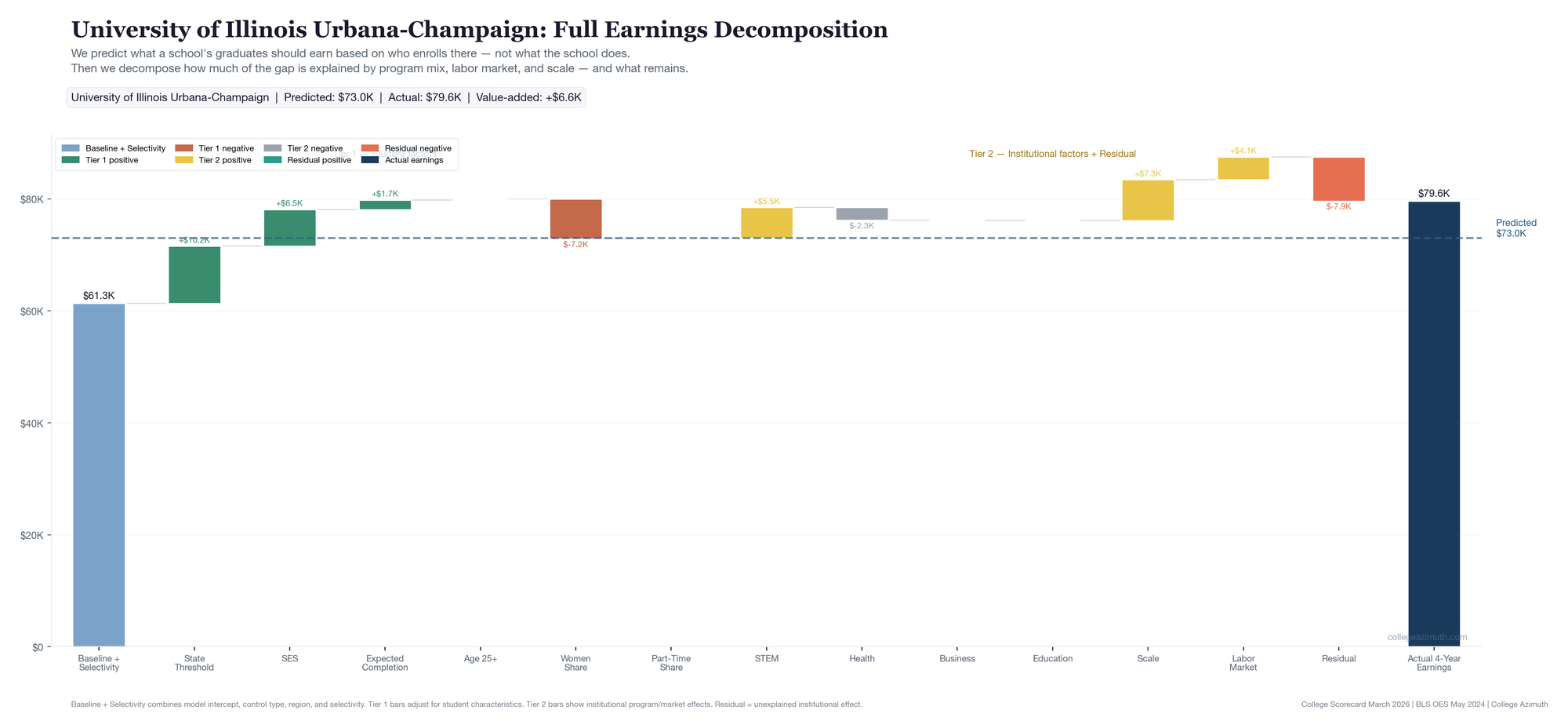
Here's how the full decomposition looks for each school — Tier 1 student factors on the left building to the predicted line, then Tier 2 institutional factors and the residual on the right building to actual earnings.
UChicago starts from a high baseline ($85K) — elite tier, wealthy student body. SES pushes the prediction up further. But the real story is on the right side of the dashed line: after crediting STEM, scale, and labor market alignment, $19,236 remains unexplained. That teal bar is the largest residual of the five.
UIC starts from a much lower baseline ($53K) — open-leaning admissions, and SES pulls the prediction down further (-$7.6K). The predicted line lands at just $52K. But look at the right side: meaningful contributions from STEM and scale, and a +$10,050 residual that the observable factors don't explain. This is the WAR concept in its clearest form — a school that starts from a low expectation and beats it for reasons the model can't fully account for.
Northwestern looks a lot like UChicago on the left side — high baseline, strong SES. But the right side tells a different story. The Tier 2 bars (STEM, scale, labor market) account for nearly all of the gap. The residual is slightly negative (-$953). Northwestern's outcomes are strong, but the model can already see why.
DePaul is the only school where business is a major positive contributor (+$2,601 — 30% business share). Labor market alignment and scale do most of the rest. The residual is small and positive (+$1,701). A school whose outcomes are mostly explained by what it chose to teach.
UIUC has the most Tier 2 bars of any school — 42.5% STEM, the largest scale effect (+$7,316), strong labor market alignment. Its total value-added is positive (+$6,643). But the program attribution alone is +$14,505 — more than double the total gap. The residual is -$7,862. The school's outcomes are strong, but that strength is already explainable through its portfolio.
What the decomposition tells us
| School | STEM | Health | Business | Education | Scale | Labor market | Residual |
|---|---|---|---|---|---|---|---|
| University of Chicago | +$4,578 | -$2,714 | -$1,344 | +$166 | +$4,119 | +$4,349 | +$19,236 |
| UIC | +$3,967 | -$1,165 | +$979 | -$38 | +$6,312 | +$982 | +$10,050 |
| DePaul | +$795 | -$2,215 | +$2,601 | -$4 | +$5,387 | +$3,116 | +$1,701 |
| Northwestern | +$5,056 | -$2,576 | -$686 | +$133 | +$4,517 | +$3,495 | -$953 |
| UIUC | +$5,477 | -$2,268 | -$78 | -$5 | +$7,316 | +$4,064 | -$7,862 |
UIUC has the largest program attribution of the five — $14,505 worth. It has a 42.5% STEM share, a large enrollment driving scale effects (+$7,316), and strong labor market alignment (+$4,064). Its total value-added is positive — graduates earn about $6,600 more than predicted. But the program attribution alone accounts for more than that entire gap. Once you credit the portfolio, the residual is -$7,862. The school's outcomes are strong, but that strength is already explainable through what it offers and where those programs land.
UChicago is the opposite. Its program attribution is $9,153 — real but modest relative to UIUC. After accounting for STEM, scale, and labor market position, $19,236 remains. That's the part the model can't explain through observable institutional choices.
One thing worth flagging here: program composition as a proxy has limits. UChicago shows a negative business contribution (-$1,344) because it has 0% literal business majors (PCIP52). But plenty of UChicago economics graduates end up in business roles. This isn't a UChicago-specific quirk — people get jobs in business who come from other majors all the time. The program classification in the data doesn't map cleanly to career outcomes, and this is one reason to be careful about how much weight you put on the composition layer. It explains a real portion of the variance, but it's not the whole story, and cases like this are a good reminder of why.
Northwestern's total value-added is positive — +$8,986. But the residual is slightly negative (-$953). Almost all of its above-expectation performance is accounted for by what it offers: the highest STEM contribution of the five (+$5,056), strong scale and labor market effects. That's not a knock on Northwestern. The school's portfolio is strong. The model just isn't finding something extra beyond it.
DePaul tells a different kind of story. It's the only school where business is a major positive contributor (+$2,601) — 30.1% business share. Its labor market alignment is the second highest (+$3,116). But the residual is small — +$1,701. DePaul looks like a school whose outcomes are mostly explained by what it chose to teach and where those programs land. That's a fine story. It's just a different story than UChicago's.
One way to think about this pattern: if a school's strengths are already visible — strong STEM portfolio, good labor market position, large scale — then much of its value is already "priced in" to what you can observe. Schools like UIUC and Northwestern fall into this category. That's not a criticism. It just means the model can mostly already see why they perform well. Schools like UChicago and UIC, where positive residual persists after all the observable factors, are telling a different kind of story — one the model can't fully explain.
UIC is the one I keep coming back to. It carries meaningful positive attribution and retains a positive residual of ~+21k. When I first looked at UIC in the original Illinois analysis, it stood out with the simpler version of this metric. It still stands out in the more granular version — and now you can see why. It's not just a STEM/health portfolio story. The scale effect is the largest of the five (+$6,312), and there's still $10,050 the model can't explain on top of that.
The Tier 1 inputs — why the baseline matters
| School | Tier | Econ composite | Expected completion | Actual grad rate |
|---|---|---|---|---|
| University of Chicago | elite | 1.046 | 91.1% | 95.9% |
| UIC | open_leaning | -0.871 | 49.6% | 61.6% |
| DePaul | open_leaning | 0.351 | 59.0% | 67.8% |
| Northwestern | elite | 1.220 | 92.2% | 95.1% |
| UIUC | moderate | 0.748 | 71.9% | 85.1% |
UIC's econ composite is -0.871. The model expects it to produce lower earnings than UChicago or Northwestern before any school does anything distinctive. UIC's value-added is high not because its graduates earn as much as UChicago graduates — they don't — but because they earn much more than the model predicts for a school with that student profile. That's the WAR concept in practice.
Bottom line
The value-added metric evolved from a single earnings-above-expectation score into a layered framework:
- What does a school's student profile predict? (Tier 1)
- What portion of the gap is explained by program mix, scale, and labor market alignment? (Tier 2)
- What remains after everything observable is accounted for? (Tier 3)
Each layer answers a different question. Together they let you read a school's outcome more honestly — not just whether it beats expectations, but why, and how much of that is the institution vs. its portfolio vs. its student body.
What we're not claiming
- We are not claiming 4-year post-completion earnings equal first-job earnings. The timing depends on time-to-degree.
- We are not claiming the downside/upside baskets are official Department of Education institution-level percentiles. They're constructed from observed program mix.
- We are not claiming the residual is proof of causal institutional quality. It's what remains after observable factors. That could be faculty, culture, networks, or things we don't have data on.
- We are not claiming the old 10-year series is useless. It measured a different cohort over a longer horizon.
Data: College Scorecard March 2026 refresh + April 2026 value-added model closeout | BLS OES May 2024 | Analysis: College Azimuth