
Thinking about Higher Ed and Labor Market Alignment


Happy July, everyone — and apologies for the delay. As I think I mentioned, I've been going through an international move with the family to Canada, and apparently that's hard with three young kids. Anyway. Back to it.
A quick shout-out before the main event: to Leadership Brainery, who took our supply-and-demand work and built it into an interactive tool for graduate degrees. Seeing the work get picked up and extended is exactly why we put it out there.
Today I want to pick up on that, and on some other labor-market related thinking I've been doing. One of the things we started to tinker with in our work on earnings beyond expectations is how much of an institution's earnings is tied to how aligned it is with local labor markets and in-demand jobs. I want to expand on some of that thinking here, as we think about folding it into our institutional profiles.
The debate around higher education usually centers on "return on investment" — as a measure of upside, the ROI calculation. A student can expect to earn "a million dollars over a lifetime and what not". To the extent we talk about downside it's usually for the egregious outcomes, degree mills, for profits etc.
But one of the main reasons people go to college is downside limitation. I've written before about how failing to look at the downside leaves a lot of people wanting, and the labor-market piece of that is a big part of it. In the real world, people ask questions like "What happens if I don't get a job right out of college? What happens if I can't get one in my field? What happens if the job I can get is going away, and it's never coming back"?
All of these are separate from the question of "does the degree pay". It might "pay" but it might also mean I'm doing something very different than what I thought I was going to do. It might mean I end up going to graduate school to get to where I needed to go.
The downside isn't hypothetical, either: Strada and the Burning Glass Institute found that 52% of four-year graduates are underemployed a year out — and roughly three-quarters of them are still underemployed a decade later. The first job sticks.
So today I want to unpack the second part of the supply-and-demand work, this time from the institution's side. In theory, a school should be responsive to the labor market. If its graduates don't get jobs, they don't repay their loans — and they certainly don't come back two decades later to put their name on a building.
Every incentive a school has points the same way. And the research mostly backs the theory: a 2023 NBER study (Conzelmann et al.) found that four-year schools really do shift what they teach when demand moves — producing on the order of 1.3% more degrees in a field for every 1% rise in local demand for it.
But "responds on average" and "ends up well-positioned" are not the same sentence. So we've been thinking a lot about how we might both measure, and evaluate alignment with local labor markets, let's unpack that a bit.
Thinking about labor alignment in higher ed institutions
As we've discussed a lot prestige is a proxy for many measures of quality, and labor market alignment really is no exception to that rule. The more selective, the more prestigious, the better-resourced a school is, the more tightly we assume it's tuned to the labor market. It's an intuitive assumption, and hardly anyone stops to test it, at least not in the consumer facing space.
However, that heuristic doesn't quite survive the research. The NBER study we mentioned previously found responsiveness goes the other way — less-selective, less-research-intensive schools adjust what they teach to shifting demand more than selective, research-intensive ones, because they have the spare capacity to add seats when a field heats up. The prestige schools, oversubscribed and capacity-constrained, tend to ration the hot majors instead — GPA gates on computer science, capped admissions — rather than expand to meet the demand. So the intuition that a better school is a better-aligned school isn't just unproven. On the evidence, it runs backwards.
Which leaves the real question: if prestige doesn't tell you, what does? You have to look at what a school is underneath the branding — and a couple of things about that show up in the data.
What does this school actually teach? Not what the viewbook says — what students complete, weighted by how many complete it. A school is its program portfolio. Brochures can say anything; cohort volume is a revealed preference. If 80% of a school's completions are in health fields, it's a health school regardless of the mission statement.
What do those programs point toward? Every program feeds certain occupations. Map programs to occupations and you can score the markets on the other side: job access (are there enough nearby openings relative to the graduates being produced?), durability (does longer-run demand look stable or growing?), and supply balance (is the pipeline into the field crowded, or is there room?).
A technical note: some majors map cleanly onto an occupation and some don't. Nursing points at nursing. Business points at banking, HR, sales, operations, and consulting all at once. Where that major-to-job mapping is loose, we mark the program ambiguous and carry that share alongside the school's score rather than guessing at it.
In large respects, this mirrors a lot of the work we did for the supply-demand map: the jobs opening up in a field each year against the graduates coming out to fill them. Annual flow against annual flow. We can just look at it from an institutional perspective and determine how aligned it is with the gap in supply and demand.
To refresh that work, we looked at each metro, the local openings a field will generate against the graduates its colleges produce, and ask how much of the demand the pipeline actually covers. Nationally, the four-year pipeline fills about 62% of bachelor's-level openings — six of every ten — and 296 of 391 metros come up short. That's the geographic angle: where is the work, and where is nobody being trained to do it.
Add up the same comparison by institution and you get this piece. Instead of standing in a city and looking at its colleges, you stand at a college and look at its programs: for everything this school actually graduates, weighted by how many, how much points toward fields with openings, durable demand, and room to absorb more people? The map asks whether a place is covered. This asks whether a school is pointed at the coverage.
Same data, two directions — and a family is really asking both at once: is there work in the field I'm considering, and is this school built to put me near it? There's a third question sitting under both, whether being pointed at a strong market actually shows up in what graduates earn. That's the earnings-beyond-expectations work.
Looking at Today, and at Tomorrow
There are really two big questions we need to answer: are the school's biggest programs pointed at work that exists right now, and are those fields growing or shrinking? A school can be a clean yes on the first and a shrug on the second.
This is a highly salient topic, since ROI calculations have historically looked very favorably on computer science programs — but what if it's true that AI is going to make a lot of those jobs obsolete? Concerning!
So we try to evaluate both. Alignment today sorts the program mix into broadly aligned, mixed, or narrow. Trajectory ahead asks where those fields are going — rising, steady, or cooling — or unrated, when the trend data is too thin to call. Put the two together and a school lands in one of nine cells: aligned and rising, aligned but cooling, narrow but rising, mixed and cooling, and the rest.
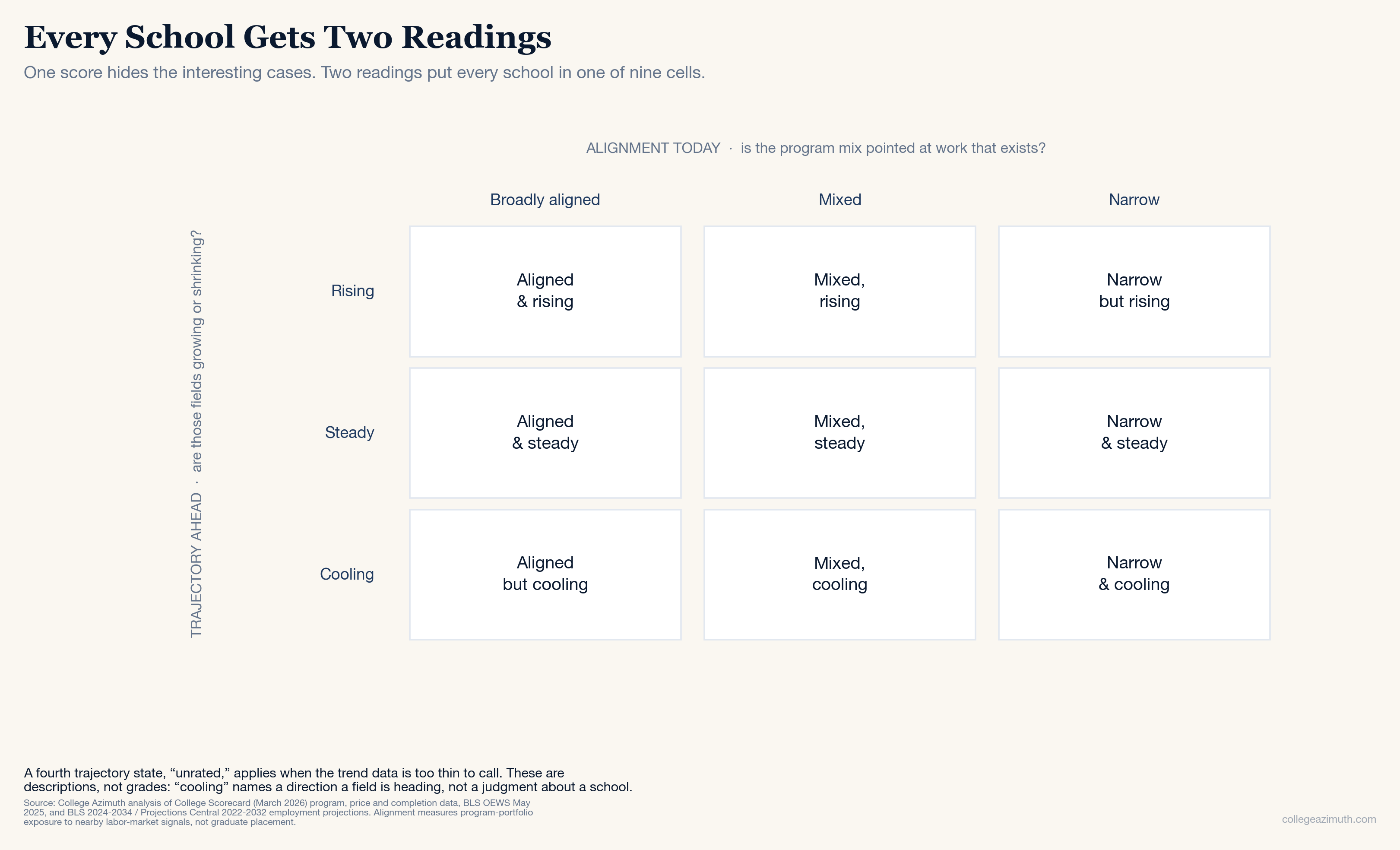
The grid exists because one number kept hiding the cases that matter. Picture an art and design college that trains capably for real occupations — illustration, industrial design — in fields that are slowly contracting. On a single "how aligned is it" score, it looks fine. On the two-part read it's aligned but cooling: doing right by its craft, pointed at a tide going out. That's a description, not a verdict — cooling names a direction, not a grade, and never a bad school.
We should note that this isn't an AI forecast. It comes straight from demand data — projected openings and growth in the occupations a school's programs feed. This data is taken from state and federal department of labor projections. It's fair to assume that these lag a fair amount and aren't always aligned with massive real time shifts.
So if you look at a field like computer science, the data says it's a growing field, and whether AI is rewriting those projections is a real and serious question. However, it's a separate scenario we'd label as its own thing, not a thumb we press on the trajectory number.
Moving back to the analysis, concentration is what pushes a school toward the edges of the grid, and it cuts both ways. A narrow portfolio is a leveraged bet on one field: a nursing school in a nursing shortage is narrow and rising, riding a good wave; a school the same shape pointed at a cooling field is narrow and cooling, with nowhere else to send its graduates. Breadth is the hedge — a school spread across many fields, the kind whose majors could each feed a dozen occupations, rarely rates cooling as a whole, because no single field turning moves the portfolio far. What reads as an unfocused mix on the alignment axis is, on the trajectory axis, diversification.
Which is the point of two readings instead of one. A school perfectly tuned to today's labor market is not automatically a safe one, and the tighter the fit to right now, the more it has riding on right now staying put.
What It Looks Like in Texas
So, let's unpack what this looks like in one ecosystem. Texas stood out in our supply and demand map as one of the places with a huge amount of demand, and not a lot of supply.
This is a good case study because if what a school teaches matters anywhere, it matters where the work is going unfilled. And the state is varied enough to make the comparison fair: 62 four-year schools with enough program and price data to line up side by side, covering the three shapes most families choose between — the selective private, the regional public, and the school that does one thing.
One of the key things we are worried about is value for money. If people are going to good schools because they think it's more or less aligned with the labor market, or because it provides more downside protection than others that's good to know.
So let's line them up, and the first thing that jumps out has nothing to do with either reading.
| School | Net price/yr | Aligned today | Growth ahead |
|---|---|---|---|
| Baylor | $41,104 | 85.9 | +11.5% |
| SMU | $40,892 | 88.8 | +13.6% |
| UT Austin | $19,857 | 85.8 | +12.6% |
| Sam Houston State | $16,404 | 91.4 | +3.2% |
| UT Arlington | $13,951 | 90.2 | +15.0% |
| Rice | $13,370 | 88.4 | +14.8% |
| UT San Antonio | $10,836 | 89.1 | +12.9% |
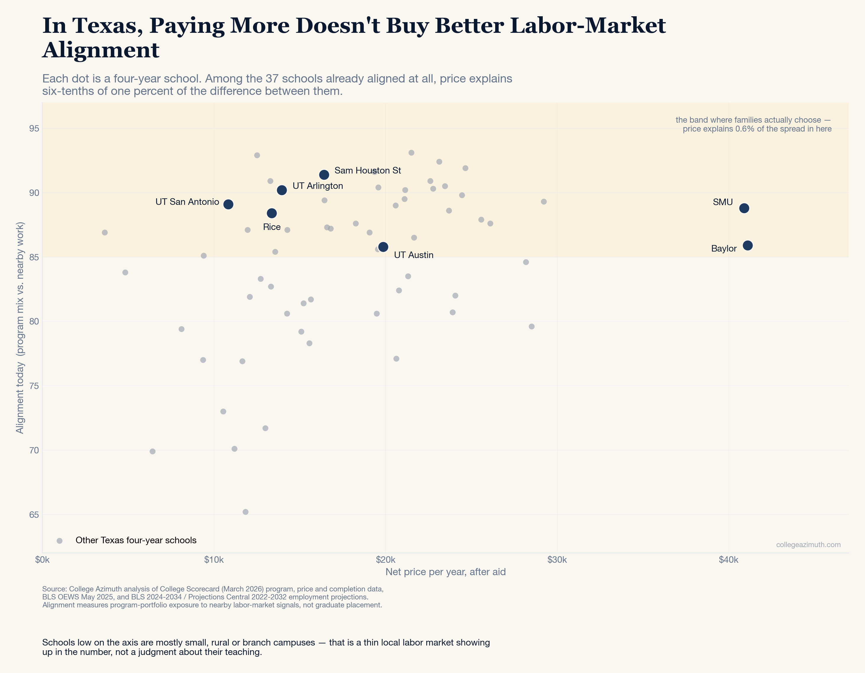
Money doesn't seem to really help much here.
Baylor costs $41,104 a year after aid and lands at 85.9. UT San Antonio costs $10,836 and lands at 89.1 — three points higher, for thirty thousand dollars a year less. Over four years that's about $121,000 more to end up slightly worse. SMU against UT Arlington runs the same way: roughly $108,000 more, 1.4 points lower. Across the 37 Texas schools that are decently aligned at all, price explains six-tenths of one percent of the difference between them. Eleven times the spread in money; eight points of spread in alignment.
Three cautions before anyone runs with that.
The first is the price column itself. Net price is an average across students receiving aid — it cannot see the families paying full freight, and it does not count a dollar of Parent PLUS. We have written at length about why that number flatters some schools and about the family debt it doesn't show. It is a blunt instrument. But comparing 62 schools means anchoring on something, and this is the best common yardstick anyone has. Read the column as a rough scale, not as what any particular family pays.
The second is the bottom of the range. Texas has schools reading 65 and 73 — East Texas A&M, Houston-Downtown, A&M-Texarkana — and they're mostly small, rural, or branch campuses. Those are thin local labor markets showing up in the number. We measure against the work that exists nearby, and Texarkana is not Houston. Read them as geography.
The third: none of this makes cheap schools better. In the range families actually agonize over, price and alignment just have nothing to do with each other.
Then the second reading rearranges the table again.
Sam Houston State is the best-aligned school in that group — 91.4, above Rice, above UT Austin, at a 90% admit rate. One number would hand it the trophy. Now ask where its fields are going: +3.2%, against a state median of +11.4% and close to the floor of everything we measured. Its biggest program is criminal justice and corrections, about a fifth of everything it graduates. That's real work, it exists right now, and it's not necessarily growing that much.
Rice is the mirror. It comes back at 88.4 — three points below Sam Houston — with fields growing at +14.8%. Ask the first question, Sam Houston wins. Ask the second, they trade places. Both answers are right; they answer different questions, and a single score would have to pick one and bury the other.
Then the specialist, which wins both questions and shows you what winning them costs. UT Health Science Center at Houston reads 94.0 aligned, +18.0% growth, and an ambiguity share of 0.06 — the cleanest signal in the state. It also graduates 94% nursing out of two programs: a conviction bet that happens to be right at the moment. Point the same shape of school at a field going the other way and you have the art college from earlier — aligned but cooling, with nowhere else to send anyone.
So that's our initial thoughts on how to start mapping this out. As always, we are very open to feedback, and welcome your thoughts on how we can make this type of analysis more accessible to everyone. Please reach out directly at daniel@collegeazimuth.com
A Note on Methodology
Alignment today is a cohort-weighted program-portfolio measure built from job access (nearby openings relative to the graduate pipeline), durability (longer-run demand), and supply balance (crowded versus undersupplied pipelines), with two context flags carried alongside: ambiguity (share of program volume with diffuse major-to-occupation mapping) and graduate-school dependence (share of volume in fields where outcomes run through further study). Trajectory ahead uses cohort-weighted projected growth in the occupations each school's programs feed. We work from continuous scores rather than the categorical bands, because the bands don't discriminate — 1,423 of 1,480 institutions share one band, and the median school shows 100% of its volume in "strong or solid" durability markets, which is exactly why a single tier label can't see a field going quiet. Texas prices are College Scorecard net price, averaged across aided students; four-year figures are simple arithmetic on that number, and if anything they understate the gap, since aid usually thins after the first year.
Data uses College Azimuth labor-market portfolio tables refreshed July 6, 2026. BLS OEWS wage/employment inputs are May 2025. National BLS projections are 2024-2034. State projection inputs remain Projections Central 2022-2032 because the current bulk Projections Central file was still entirely 2022-2032 when rechecked. College Scorecard program and institution earnings facts use the March 2026 Scorecard refresh.
What We're Not Saying
This doesn't measure job placement, and no score guarantees employment. It doesn't know whether graduates stay near campus, and it doesn't claim any school fills local shortages. Cooling names a direction, not a grade — an exposed school isn't a bad school.
Diffuse majors aren't weak majors; ambiguity is context on the way up and a hedge on the way down. When the trend data is too thin to call, we say so instead of inventing a read.
Scenarios about AI are labeled judgment and never blended into the measured numbers. And none of this replaces earnings, debt, completion, or how programs perform against their peers — it answers a different question and sits alongside them.
Data: BLS OEWS May 2025 | BLS national projections 2024-2034 | Projections Central 2022-2032 | College Scorecard March 2026 | Analysis: College Azimuth