

AI
Some thoughts on AI and college and career decisions
AI is already in college and career decisions. The question is whether it bridges the structural advising gap families face — or drives it farther apart.
 Daniel Rogers
Featured
Data-driven analysis of college outcomes, affordability, and value. Research insights powered by verified federal data.
By Daniel Rogers · College Azimuth Research

We updated our value-added earnings metric — the WAR for colleges. The model now separates what students bring in, what a school offers through its program mix and market position, and what remains unexplained. Here is how we built it, and what it shows for five Illinois schools.
Daniel Rogers
A big part of the decision of what college to go to is framed around whether or not you'll make good money coming out of it, or whether you'll get a good return on investment for your troubles. We've talked about this extensively this year — why the median ROI hides a harsher reality, what graduation rates actually count, and how to build a complete financial picture before you enroll — because how you think about return on investment is not as straightforward or as simple as people make it. In
Daniel Rogers
We mapped supply and demand for college graduates across 391 US metro areas. The pipeline fills just 62% of annual openings nationwide.
Daniel Rogers
The standard graduation rate excludes most students. Federal data shows the real number is 28 points higher at schools like UTRGV. Here's what the metric actually measures — and what it misses.
Daniel Rogers
How many loans would a no-loan school loan, if a no-loan school could give loans? If you said the answer was zero, you'd be wrong. In reality it's over 20,000 families with over a billion dollars in parent loans outstanding (across the 28 institutions with publicized no-loan or "Free tuition" plans). A couple of weeks ago Yale announced an expansion of "Free tuition" policies for students whose families are earning under 200k. I don't want to pick on Yale specifically, but we're gonna use thi
Daniel Rogers
Parent PLUS loans hide a second debt burden. We analyzed debt burdens to show how family finances change when parents borrow too—and who gets squeezed.
Daniel Rogers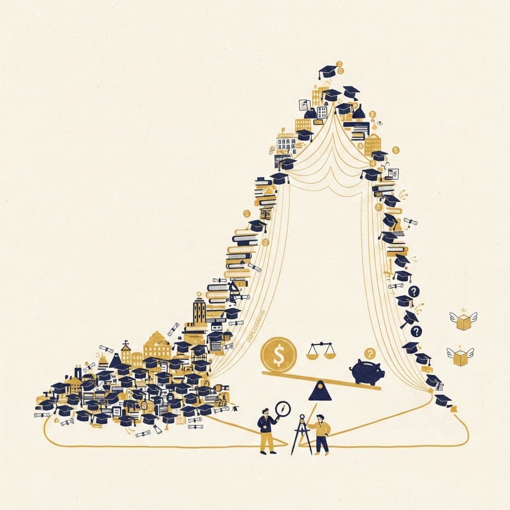
A risk framework for evaluating college debt: Green Zone, Blue Zone, Yellow Zone, Red Zone. Which schools are worth the bet?
Daniel Rogers
Financial GPS is a new framework for navigating college debt. See how payment burden tiers work, why ROI metrics fall short, and how to find schools where debt actually works.
Daniel Rogers
I want to start Part 3 with something that's been on my mind: the power of example, and the danger of leaving things unsaid. I sometimes sense a hesitance among many to talk about the downsides of college. The worry is that acknowledging the risks might discourage people from pursuing it. I had a conversation recently with a mentor whose work I really admire. She questioned whether it made sense to talk about downsides at all. Wouldn't it be better to focus on the opportunity? Here's what I t
Daniel Rogers
400,000 families a year can't afford their Parent PLUS loans. At private universities, 58% are underwater. Here's what return on investment calculations miss.
Daniel Rogers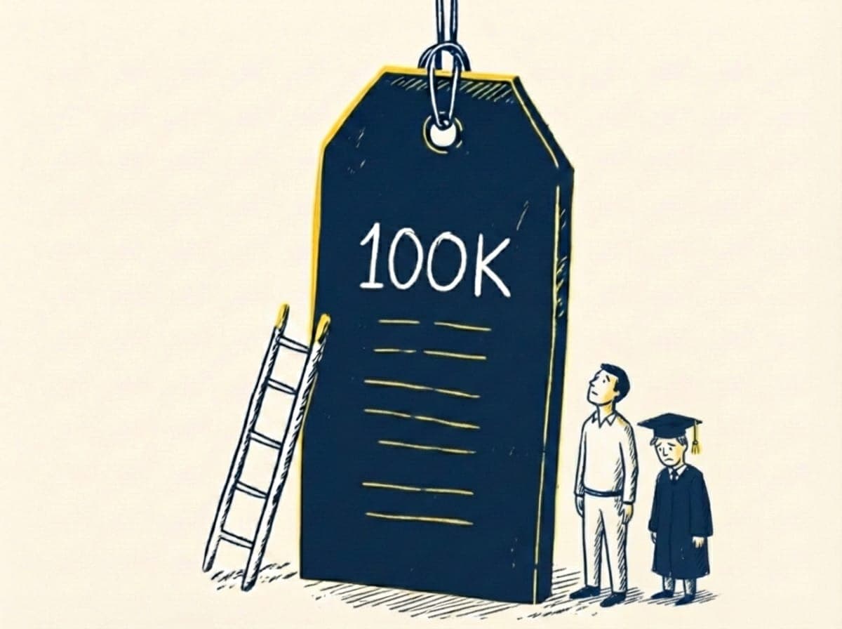
The median college grad breaks even by 27. But at the same school, net price can vary by $50K+ based on income. Here's what the affordability debates miss.
Daniel RogersExplore our data stories through interactive charts. Click any chart to interact with the data.
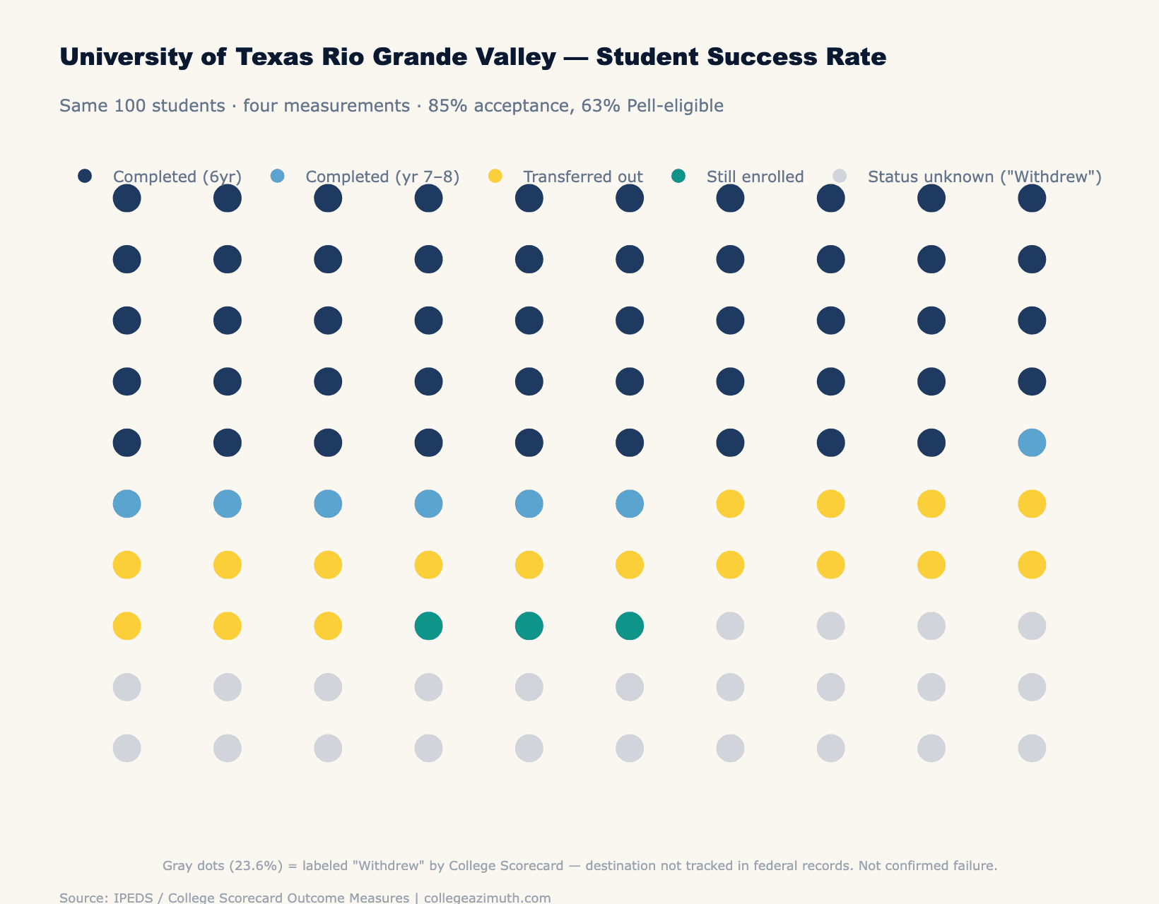
Interactive visualization showing the graduation rate gap between Pell and non-Pell students at UTRGV.
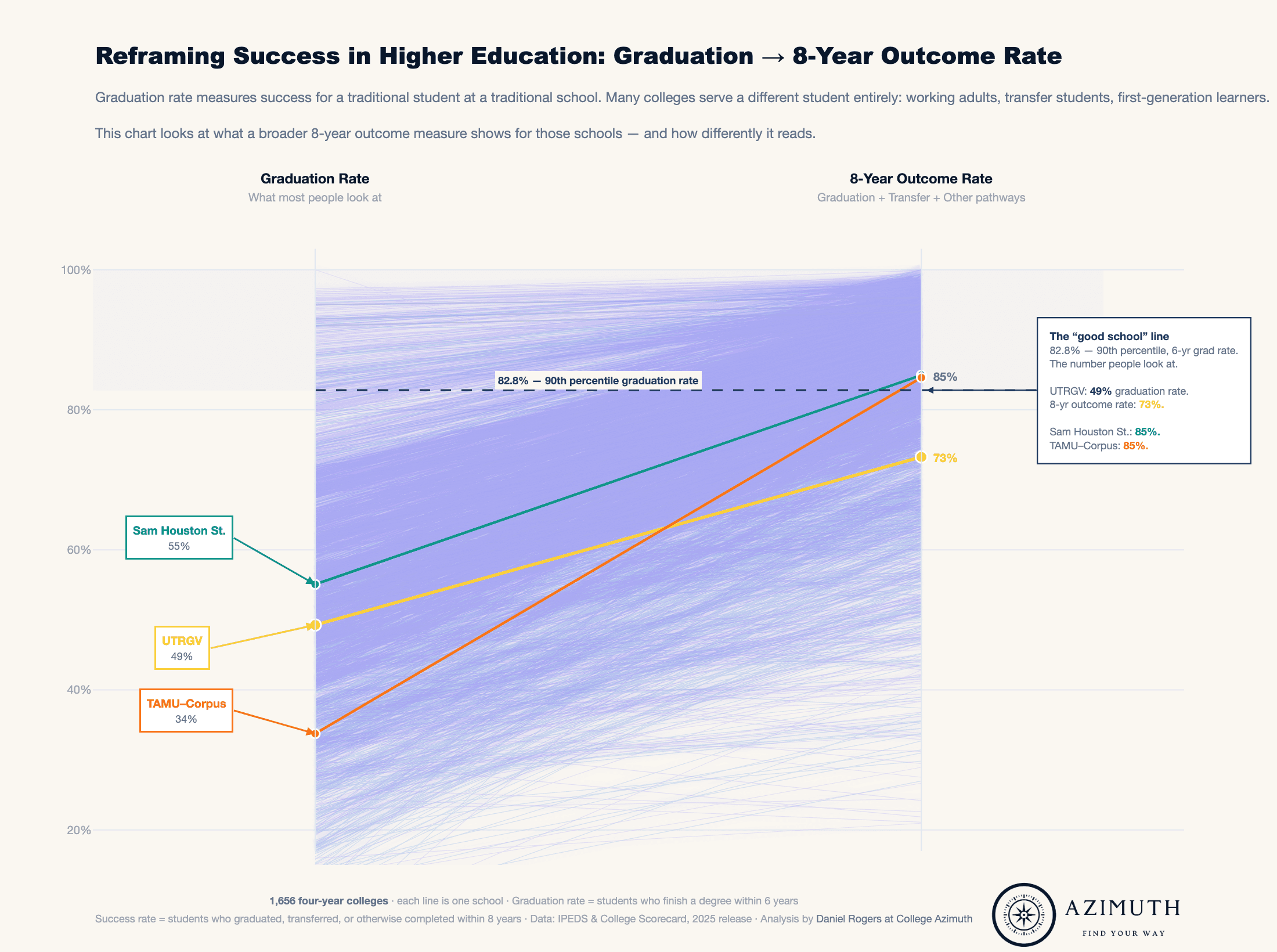
Compare graduation rate gaps across multiple institutions with this interactive slope chart.
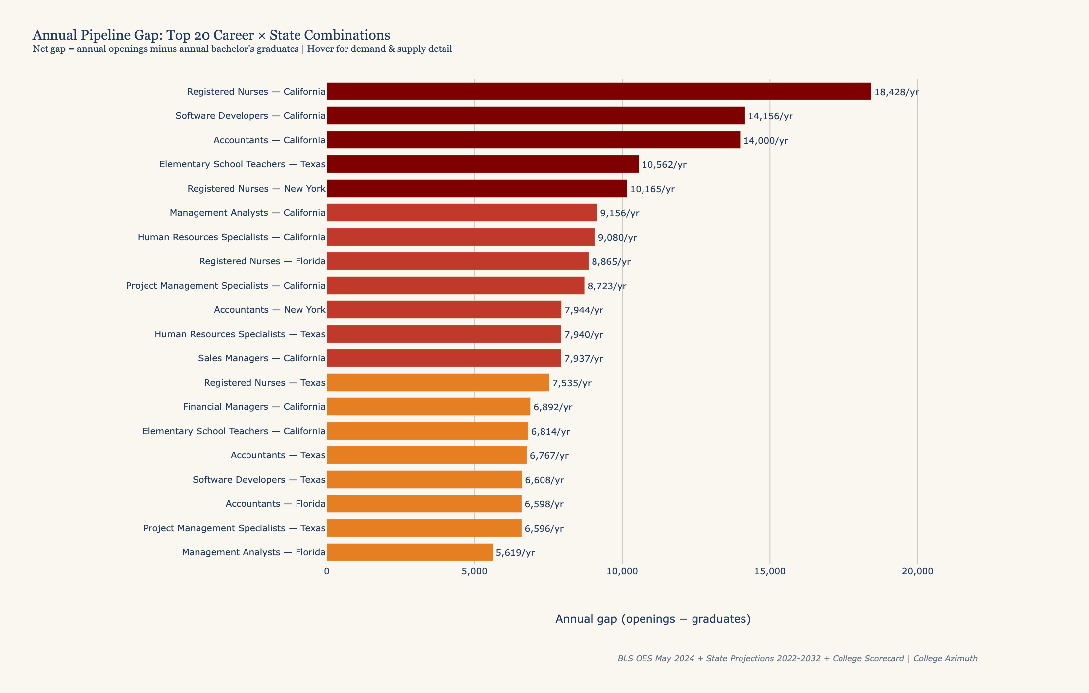
Select any U.S. state to see the top 10 careers where annual job openings far exceed the number of graduates — revealing where the talent pipeline falls short.
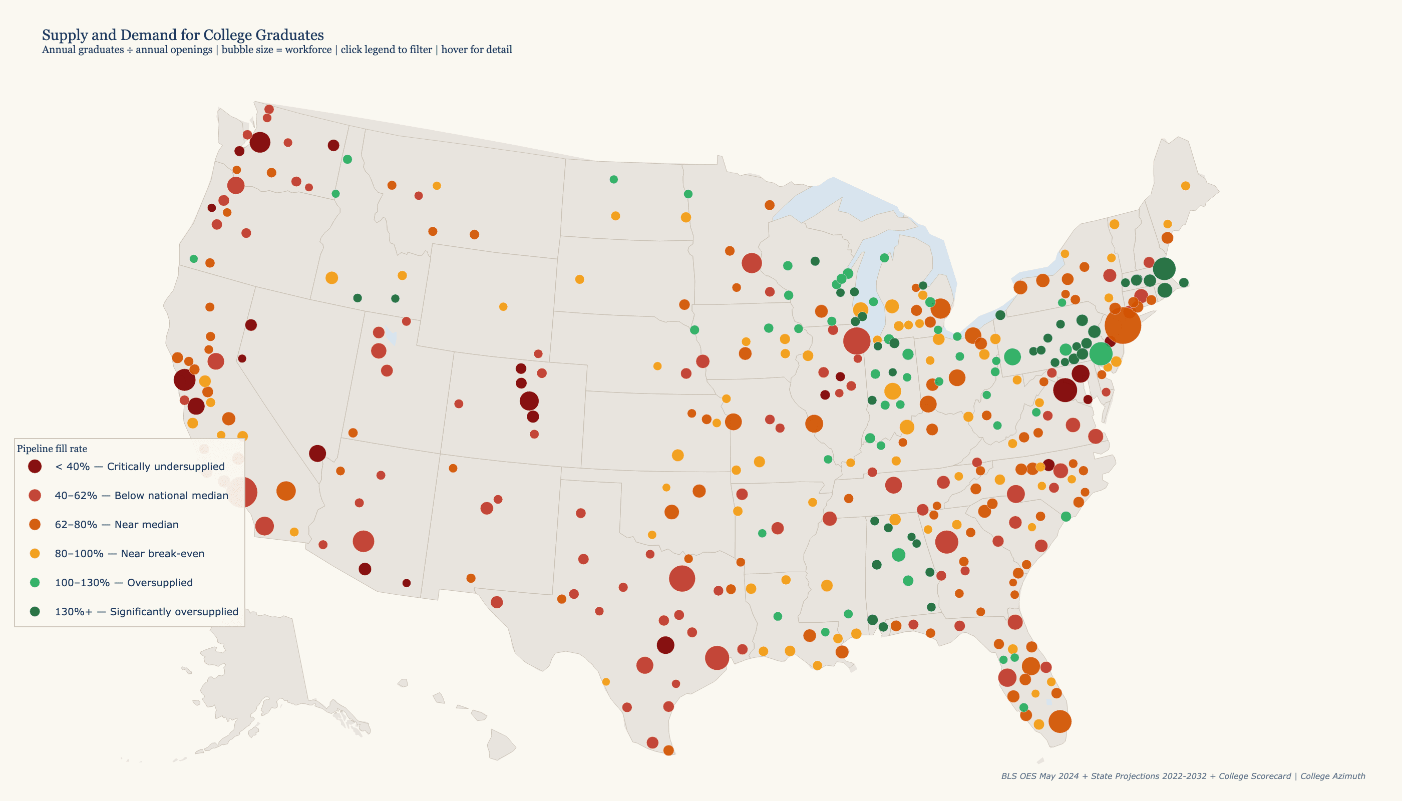
Interactive bubble map of 383 U.S. metros colored by how well local colleges fill workforce demand — from critically undersupplied to significantly oversupplied.